Modernizing Infrastructure for Digital Enterprise
Build End-to-End Custom Products
UI/UX | Front End | Back End | Database
Seamless Agile Delivery & Deployment
Design & Develop Customized SaaS Application
Augment Your Business Processes With AI
User Experience Designed for Your Product
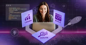
Get market-ready MVP in weeks
Improve Operational Efficiency At Reduced Costs
End-to-End Custom Software Solutions
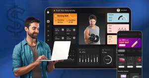
Build, Customize & Deploy Your Streaming Platform
Real-time Access to Vehicles
Software Solutions for All-Sized Businesses
Advanced AI Models to Automate Workflows
On-Board Top 3% Talents Remotely
Test Your Concept Before You Invest